5. Visualization
Yuki Atsusaka and Seo-young Silvia Kim
Source:vignettes/v5-visualizing-rankings.Rmd
v5-visualizing-rankings.RmdThe following code chunk shows how to plot the distribution of ranking profiles. This can help eyeball whether the ranking data is uniformly distributed, which can of course be formally tested.
library(combinat)
#>
#> Attaching package: 'combinat'
#> The following object is masked from 'package:utils':
#>
#>     combn
library(rankingQ)

set.seed(100)
tab <- lapply(permn(seq(3)), paste0, collapse = "") |>
  sample(30, replace = TRUE) |>
  unlist() |>
  table() |>
  table_to_tibble()
plot_dist_ranking(tab, ylim = 0.5)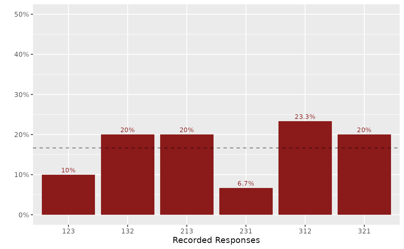
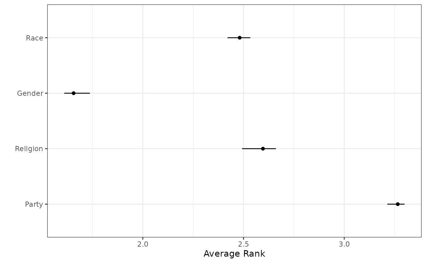
Visualizing Average Ranks
The plot_avg_ranking function creates a visualization of
average ranks with confidence intervals:
data(identity)

# First compute bias-corrected estimates
out_direct <- imprr_direct(
  data = identity,
  J = 4,
  main_q = c("party", "religion", "gender", "race"),
  anc_correct = "anc_correct_identity",
  n_bootstrap = 10
)
#> No weight column supplied; using equal weights for all observations.

# Plot average ranks
library(dplyr)
#>
#> Attaching package: 'dplyr'
#> The following objects are masked from 'package:stats':
#>
#>     filter, lag
#> The following objects are masked from 'package:base':
#>
#>     intersect, setdiff, setequal, union
out_direct$results |>
  filter(qoi == "average rank") |>
  mutate(
    item = factor(
      item,
      levels = c("party", "religion", "gender", "race"),
      labels = c("Party", "Religion", "Gender", "Race")
    )
  ) |>
  plot_avg_ranking()