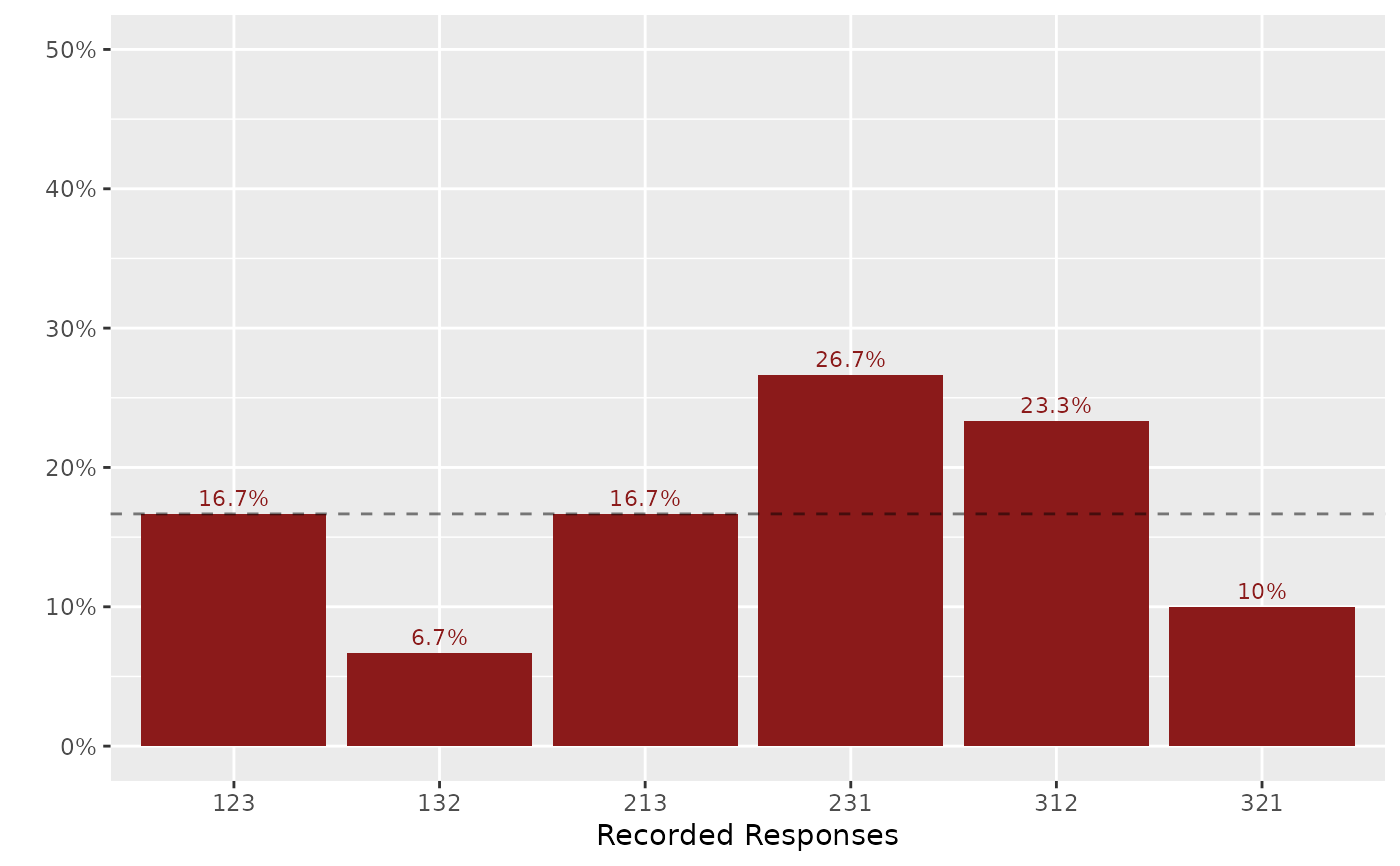
Plot the Distribution of Rankings Over the Permutation Space
Source:R/plot_dist_ranking.R
plot_dist_ranking.RdThis function takes a table in which the frequencies of ranking patterns
are recorded and plots it over the permutation space of rankings, using
the ggplot2 package.
Usage
plot_dist_ranking(
  tab,
  x = "ranking",
  y = "prop",
  ylim = 0.315,
  fill = "firebrick4",
  xlab = "Recorded Responses",
  family = NULL,
  vjust = -0.5,
  size = 3,
  linetype = "dashed",
  h_color = "black",
  h_alpha = 0.5
)
Arguments
- tab
A table in which the frequencies of ranking patterns are recorded.
- x
Name of the column that contains permutation patterns.
- y
Name of the column that contains the plotted values (for example, proportions or frequencies).
- ylim
The upper limit of the y-axis.
- fill
The color of the bars.
- xlab
The label of the x-axis. Defaults to "Recorded Responses".
- family
The font family of the text.
- vjust
The vertical justification of the text.
- size
The size of the text in `geom_text`.
- linetype
The linetype in `geom_hline`.
- h_color
The color in `geom_hline`.
- h_alpha
The transparency in `geom_hline`.
